Tuesday, March 8, 2011

Hercules - Part II

Did some more work on Hercules and here is the current state of the drawing.

Hercules drawing in progress...
I detailed the club as well as the lion skin draped that is draped over the club. I also added details to his hair and beard. What is left now is his left hand and his feet. Hands and feet are difficult to get right so I think I will do some practices studies to get more familiar with the construction. 

Thankfully my wife gave me a plaster cast of a very famous foot! Hehe...the foot of David as sculpted by Michelangelo. That will come in handy for my upcoming studies... 

Saturday, February 26, 2011

Hercules - Part I

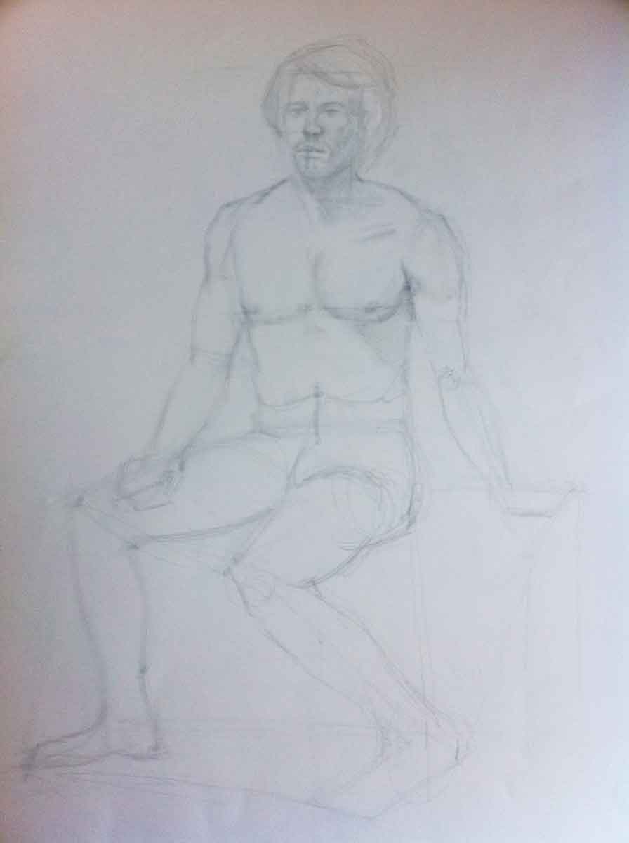
In my previous post I showed you my new Hercules statues. I have had him for about a week and here is first pass of my drawing.


Drawing of Farnese Hercules statue


Still have to draw his right hand, feet as well as the club he is leaning on. Hair and beard needs to be detailed as well. After having completed all of that I would need to go over the drawing to add more contrast. I am sure I will get some good pointers from Igor and the rest at the Academy when I bring it in.

Home studio setup and new statue

Here is a picture of my home studio setup. Basically just have an easel in our guest bed room and a couple of statues that I draw from. An iPod speaker dock with an iPhone (first version) playing classical music via Pandora is really good for getting the mind in the right mood.

Studio setup

Also recently ordered a new statue from Design Toscano. This time it is the greek demi-good Hercules. The statue is 30 inches tall and has a lot of details so I think it makes for a good study. This particular statue is called Farnese Hercules statue and was an ancient statue from around 3rd century AD.

The Farnese Hercules statue

Wednesday, February 2, 2011

From the Sketchbook: Bernini's David


Bernini is a Italian master sculptor whose work I enjoy very much. While visiting Rome last summer there was plenty of opportunity to see his work. He has a magnificent statue in the middle of Piazza Navona that were featured in the movie "Angels & Demons"  (where one of the cardinals almost drowns). He designed St Peter's square and have a bunch of statues around the church as well as created the baldachin inside the church. He was very prolific and was (in my mind) the greatest sculptor during the Baroque era.

My sketch above is of the head of Bernini's David statue...that particular statue we never got to see since we never visited Villa Borghese in Rome. Reason for going back to visit again...

Click on picture to see a larger version.


Tuesday, February 1, 2011

From the Sketchbook: Back study

I try to draw something everyday be it a longer drawing of some type of plaster cast or just a couple of quick sketches. When I do my sketches I tend to be more loose when it comes to measuring the proportions and other aspects of the construction. That is not necessarily a bad thing because you are still training your eye and this will improve your quickness and reduce the need for explicitly doing all the construction steps. Anyways, from time to time the sketches turns into to something interesting that I will upload here. This time it is a sketch of a man's back. 

Back study
This is actually the back of a video game character called Kratos from the video game God Of War. I am not a big gamer but the game features art from Andy Park who is an artist that I like. I never really finished this sketch but was happy with how some of the muscle definition came out. I look forward to get into more anatomy to enable me to capture the details even better. 

Friday, January 28, 2011

Abraham Lincoln - Final


Since the last post I have worked on the hair as well as giving some details to the suit. I feel like I am at a state where I can say that I am finished. I have spent roughly 6 hours on this drawing and feel pretty good about it. I will be taking this to Sofia Art Academy on Sunday and have Igor, Sofia and the rest of the gang take a look at it and give me some pointers. Always room for improvement though but I think I will find some other motive to draw for my next project.   Click on the picture if you want to see a larger version.

Tuesday, January 25, 2011

Abraham Lincoln - Part 2


Yesterday and today I continued on my drawing of President Lincoln where I focused on adding more layers of value and refining the edges. I detailed the ear and then started to develop the beard. Working on the beard was very tedious and I think it came out pretty OK. Next step will be to work on the forehead and the hair. I should probably also work on his suite but that can wait until the actual portrait is closer to done I think. Click on the picture if you want to see a bigger version.

Abraham Lincoln - Part I


A cornerstone of learning classic drawing is that you copy various plaster casts and I have been doing that for more than two years now at Sofia Art Academy. For Christmas, my wife Anne gave me a Abraham Lincoln bust  so that I could practice at home. Last weekend I started to draw the President and the picture above shows how it looks after the first layer (1.5 h worth of work). I have focused on the proportions of features and capturing the various shadow shapes in order to achieve a likeness. Next step will be to further develop the shadow shapes with more value as well as refine the edges. Refining the edges means to keep the form shadows soft and the cast shadows hard.

Monday, January 24, 2011

Live model figure drawing


Had a Live model class yesterday at Sofia Art Academy and here is what I did. This was just my second live model figure class so I still have lots to learn..

Pieta doodle

This is a quick doodle I did last night somewhat inspired by Michelangelo's Pieta. I didn't use a reference for this drawing so it doesn't really look like anything but I thought it came out kinda nice with the shading. This was just a 20 minute sketch but next time I think I will take more time and use a reference photo and try to capture the likeness of this magnificent statue. 


Monday, November 15, 2010

Life Drawing at the Academy


Here is a portrait that I did yesterday afternoon at the Sofia Art Academy. This is the first portrait I have done where the drawing actually starts to resemble the model. Not quite there yet but it is getting better.

Wednesday, November 10, 2010

Portrait of David (February 2010)


It was a long time ago since I posted anything here but now I have been able to produce a couple of portraits that I wanted to upload and show. The two portraits in this post is interesting because they are done 9 months apart. It is of the same subject (Michelangelo’s David) from almost the same position and I can see that there is a difference in quality between them. Still have a long way to go but it is getting better…


Portrait of David (November 2010)

Wednesday, May 19, 2010

Human figure drawings

Here is two pictures of a couple of drawings I have worked on at the art academy. They are both not finished…mostly concerned about the construction side of things right now and I will do one where I apply tone as well…but one step at a time I guess. The picture quality isn’t the greatest. I need to come up with a better way of digitizing my drawings.
Anterior view

Posterior

Saturday, February 21, 2009

David's ear - Final

Here is the final version of the ear. It took two sessions at the Art academy to get to this point. 


Most of the work during this session was spent on making the background look less flimsy as well as make the outline of the shape more precise. This was achieved by adding more tones to the drop-shadow.

Friday, February 20, 2009

David's ear - Part I

Next part up is the ear. This is one of the easiest facial features to draw and it went pretty quick to get the results seen here: 

Basically the ear consists of two ovals. One big on the top and one small on the bottom. The trick is to get the proportions of these ovals correct. You size the width/height of each oval against the entire length of the ear to make sure that the proportions are correct. It is also important to capture the direction of the oval so it looks like the model. After the initial construction work you start working on the details which was a lot of fun. Left to do is to add more layer of tone so that ear looks more realistic…enhance the contrast between areas.

Monday, February 16, 2009

Drawing Tip #4 - Beware of outline!

While drawing the contour of an object it is easy to make it look like it just an outline…a dark line. However, this doesn’t look very realistic, things don’t have an outline in the real world…everything just blend together. That is why it is important to look for areas on your drawing that looks like outline and softening them up by eraser or trying to blend the neighboring areas with the same tone.

Sunday, February 15, 2009

David's lips - Final

Completed my drawing of David’s lip. Pretty happy with how it turned out. Sofia from Sofia Art Academy showed me how to make the lower lip to look more full. Trying to make the strokes follow the shape as much as possible and paying attention to how the tone changes depending on the light that strikes the lower lip.


Tuesday, February 10, 2009

Drawing tip #3 - Don't copy, analyze!

Igor, my teacher at Sofia Art Academy, keeps stressing that students in the school of classical traditional drawing don’t just copy what they see; instead they analyze the model and make decisions on construction and tone based on that analysis. This is something that I am still find hard to do. Basically you should be asking yourself a bunch of question while you are drawing…how light is that area comparing to its neighboring area, how is that curve different from this curve etc… The trick is to be able to compare with the model and to do that it is important to view your drawing from a distance.
You should: Squint your eyes…look at the subject..look at your model… look at the whole picture to try to see what areas needs more work. 
If in doubt, always look at the model. It should be telling you what is needed. If something doesn’t look right ask yourself what you need to do about it and then check the model. Do you need to add more layers of tone…do you need to make an adjoining area darker. It is all about comparing parts of the drawing with the same parts on the model. 
When I was working on the lips the upper lip started to have this dramatic transition between two areas. The transition looked really hard and not very natural and I couldn’t see the same transition when looking up at the model. So what was wrong? Either I should add more tone to the upper lip to smoothen out the transition or I should remove some layers (using eraser). Which alternative should I choose? 
The model will give you the answer!
I started to look at the model but wasn’t able to solve my problem. Igor told me to look again and this time to look at the whole model not just the area that I was concerned about. I squinted my eyes and started comparing the model and the drawing to see if anything stood out. I could tell that there was an area above the upper lip that looked darker on the model than on my drawing. I started with adding some more layers of tone to this area and then put the drawing at a distance from me again and starting comparing. Now I saw that the area that I just worked on was blending together with the upper lip…that was the confirmation I needed. I added more tone to the upper lip which was the answer to my original question.

Monday, February 9, 2009

David's lips - Part II

Here is the result after last Friday’s session over at the Sofia Art Academy


It was a pretty hard session I though because I started to get into really subtle patches of shading and needed a lot of help from Igor to figure it out. I do think that I am getting more used to analyzing the model instead of just copying it but I still have a lot to learn in that department. Another thing that I slowly realized is that I have to be aware of what type of object I am drawing. I should have known that the area above the upper lip should be a bit darker then the sides of the face because it is a different plane. There is a lot of muscles above the lips that curves and it interacts with the light differently than its neighboring areas. I need to be studying more anatomy than I have done before…

Saturday, February 7, 2009

Drawing tip #2 - View your drawing from a distance

After the initial construction and after having blocked in some of the darker areas and added some tone it is important to start looking at your drawing from a distance from time to time. Place it closer to the model you are drawing so that you can easily shift from watching the model to watching your drawing. When you work on your drawing in your lap it is too close for you to get a overview of the drawing and by placing it in front of you and away from you you will be able to get that overview that will undoubtedly tell you what areas need more work. Squinting your eyes while looking at your drawing and model from a distance is important since it helps you focus on the “big picture”.